Facebook Paper
Paper from Facebook was a news-reading app that presented stories and articles in a visually engaging way. It aimed to redefine the way users consumed news and content on mobile devices.
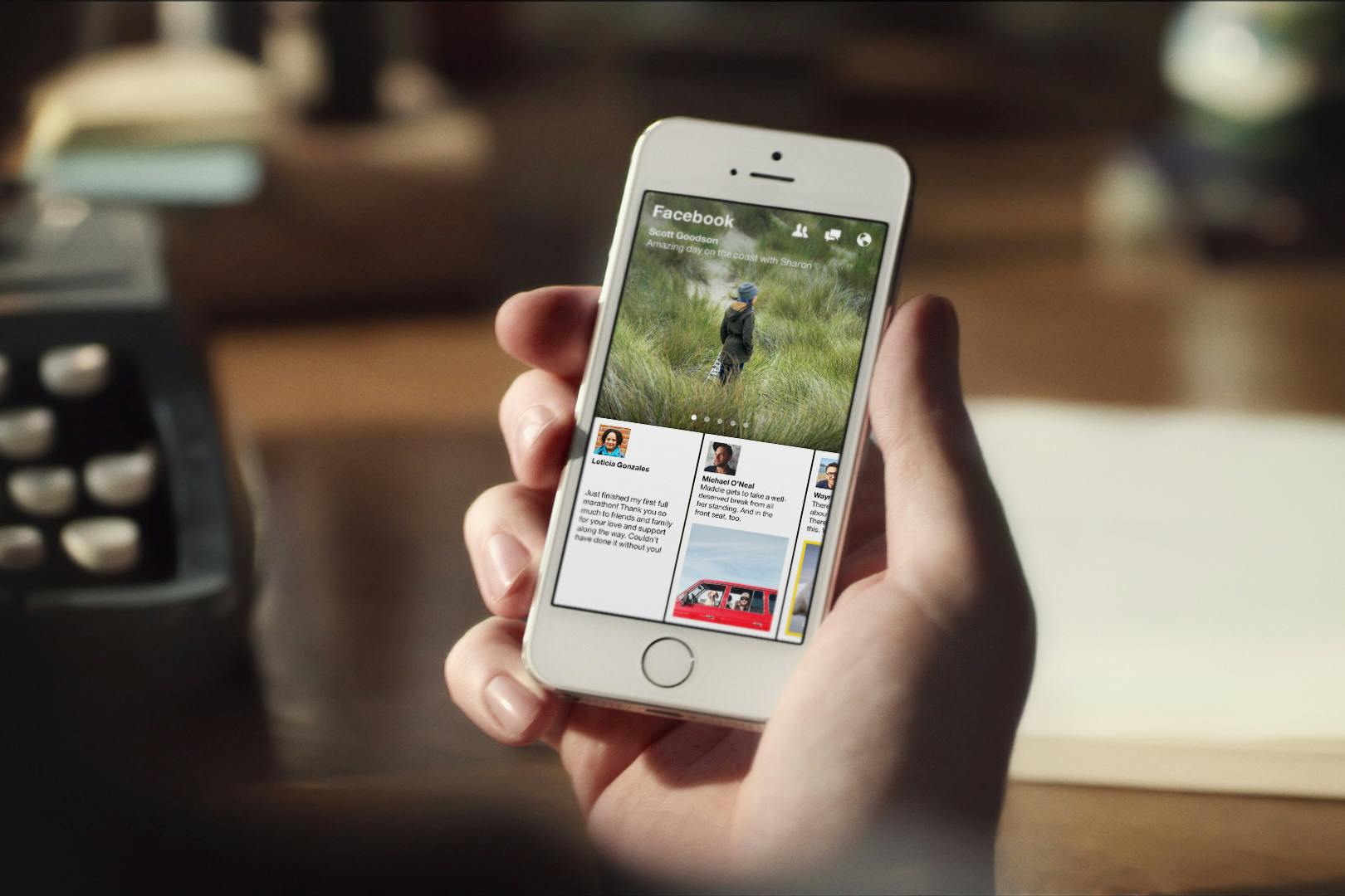
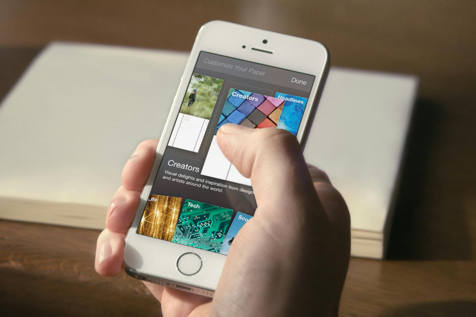
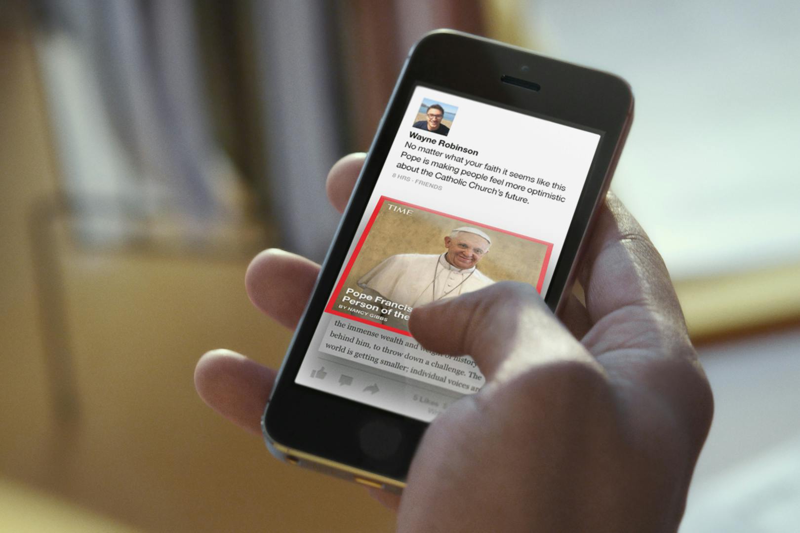
It was designed to break away from Facebook's traditional timeline and brought about several gestures that translated from the real world, like flipping open a book or a newspaper. It also broke away from traditional chrome and buttons interface by giving images and content front and center placement and made consumption easy and aesthetic.
Quote from Facebook's announcement of Paper says "Paper makes storytelling more beautiful with an immersive design and fullscreen, distraction-free layouts" and had Facebooks' strong social features baked right in!
The app was created by Facebook Creative Labs, a new team of extremely talented people like Mike Matas, Loren Brichter (the inventor of Tweetie), Michael Reckhow (PM, Amazon Kindle), Jason Prado (ex-Google Hangouts team), among others!
It had several innovative new features like:
- Tilting or panning your phone side-to-side to view the edges of a panoramic photo instead of squishing the photo as was the standard during the release of Facebook Paper
- New WYSIWYG composer that gave users real previews of how their content would look to others to take the guess work out of composition


Glory — Here's how people showed their love of the app

Paper is the best Facebook app
Author Ellis Hamburger in his deep dive review of the app talks about how Facebook showed it's capable of breaking the mold and innovating at scale as it served 1.25 Billion people in 2014 and continues on to talking with much enthusiasm about many of its features.

Years ahead of its time
Author Josh Constine writes how the app feels modern, and maybe too modern in some cases. He goes on to talk about many of its innovative features like a tilt/pan interaction to view panoramic pictures, WYSIWYG composer, and much more.